100 Bytes of CSS to look great everywhere
TL;DR
html {
  max-width: 70ch;
  padding: 3em 1em;
  margin: auto;
  line-height: 1.75;
  font-size: 1.25em;
}
I previously tweeted out an old version of this and accidentally got a line by line code review from 100k people:
This article is the most up to date version with everyone's feedback.
Context
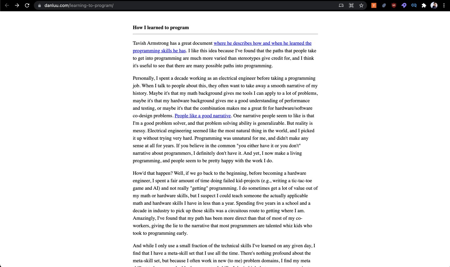
Dan Luu always writes fascinating posts, but the design makes it very painful to read:
A couple years ago, this post on HN was fairly popular, and I saved it on my spark-joy repo, which is a swipe file of design tips I've collected over the past few years.
However, I noticed that the original website link is dead. So I thought I would refresh it with what I have now implemented for Dan's site:
100 bytes of css to look great nearly everywhere
This should be simple drop-in css to look good on most displays:
html {
  max-width: 70ch;
  padding: 3em 1em;
  margin: auto;
  line-height: 1.75;
  font-size: 1.25em;
}
Let's break this down. I've adapted the original text with my own commentary.
max-width: 70ch: the "readable range" is usually 60-80 character widths, and CSS lets you express that directly with thechunit. I blogged more on line lengths last year.padding: 3em 1em: If the display's width goes under themax-widthset above, then this padding prevents edge-to-edge text on mobile. We use3emto provide top/bottom whitespace.margin: auto: This is really all that is needed to center the page - applied onhtml, because Dan's site doesnt have a semantic<main>tag and<html>is more likely to exist in most sites (no judgment pls, i've heard enough semantic HTML preaching). That the top tag centers itself relative to nothing is unintuitive, but thats how browsers do.line-height: 1.75: Spacing between the lines to help increase visual clarity. Always leave line height unitless because reasons.font-size: 1.5em: I've noticed that recent design trends and screen sizes have tended toward bigger font sizes. Or maybe I'm getting old. Preferemorremoverpxif you want to let users scale it.
Tushar points out that you can use :root instead of <html> to guarantee that there is some selector present, but its a touch too fancy for me and uses an extra character :)
Optional 100 more bytes
If you can spare a few extra bytes of CSS, I'd also recommend margins for headers, paragraphs, and lists, and softening body text:
h1,h2,h3,h4,h5,h6 {
  margin: 3em 0 1em;
}

p,ul,ol {
  margin-bottom: 2em;
  color: #1d1d1d;
  font-family: sans-serif;
}
2025 edit: Modifications
Applying Styles on Pages You Don't Control
- You can auto apply these styles on to pages with https://github.com/ankit/stylebot. I can't vouch for their security as I only just started using it.
- WaterCSS is a bookmarklet or extension or script with some nice presets: https://watercss.kognise.dev/
- SakuraCSS is a bookmarklet that does the same https://oxal.org/projects/sakura/bookmark/