8 Landing Page Tips from Rob Hope
I submitted my book’s landing page for Rob Hope’s review and he obliged! Brutal feedback incoming. I respect Rob’s opinion mainly because this is literally his thing and he is writing THE BOOK on this (if you do get it, my affiliate link is here!) .
As a first time maker I have a lot to learn, so I expect that there will be a lot of issues. Rob gave me a 5 min review which was just PACKED with insight and I am excited to internalize this and improve.
1. Erroring Checkout
If you try to buy on the page in Incognito mode, it errors because Podia (the backend I use)‘s widget uses cookies, and cross-site cookies are blocked by default in Chrome.

The only way to fix this is to move off Podia, which I’m not very keen on, or to drop the Podia widget altogether and just directly link to the Podia sales page (slightly worse experience for the majority of visitors, in exchange for better experience for the small percentage that uses Incognito).
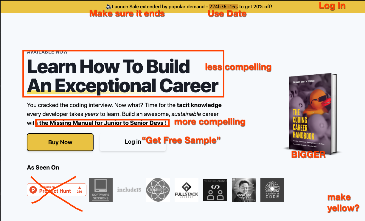
2. Communicating Launch Sale

I launched on Jul 1 and ended launch sales on Jul 14. After some people DMed me saying they missed the launch sale, I held out for a while and eventually relented by extending it to Aug 1. I didn’t spend a lot of time on this but basically the objection is that the high number of hours hurts my credibility.
I definitely don’t intend to do a permasale as that is unethical, however, I do want to figure out the best price that the market pays for my book while still having most customers feel like they got value for money (I care about total revenue more than I care about per-unit prices - I tried to market like an upmarket brand that deserves a premium for a while, but unfortunately I don’t think I know how to do that well).
Recommmendation: go with days instead of long countdown timer.
3. Duck Branding
Use it more! everyone likes it!
His recommendations:
- put duck near book reviews
- and at footer
- cheeky angle
Adds personality!

More Yellow Page inspo on his site: https://onepagelove.com/tag/yellow-color
4. Hero Section
Book Cover Too Small. Squinting to read the subtitle. Make it bigger.
“The Missing Manual” text is more appealing than “Build an Exceptional Career”.
Move Login to top of the page, See Sample instead -> don’t put you on Newsletter at all - send sample with friendly email.
Remove Product Hunt widget.
Make entire Hero section yellow?
Add 1 testimonial here.
5. What’s in the book? section
Text hierarchy is “out” - headers should be darker than body text, I have the inverse when it comes to my bolded text.
Make sample chapter links into buttons, more “actionable”.

6. Book Reviews
Too many!
Need to be more specific. Address doubts and features. 4-6 slam dunk ones.
Bring 1 testimonial up under the Hero section.

7. Pricing section
create left-to-right flow

8. About the Author
SAY WHY YOU WROTE THE BOOK

lots to chew on, as you can see! I figured I would transcribe the lessons here so I can save them for my future self. I’ll be working on making recommended changes as I go. You’re welcome to give more critiques of my page too!
If you enjoyed this you should probably buy his book prelaunch like I already have - my affiliate link here. :)